Taimi

  • website
  • redesign
  • UI/UX

Taimi Website Redesign for The Leading LGBTQ+ Dating App.

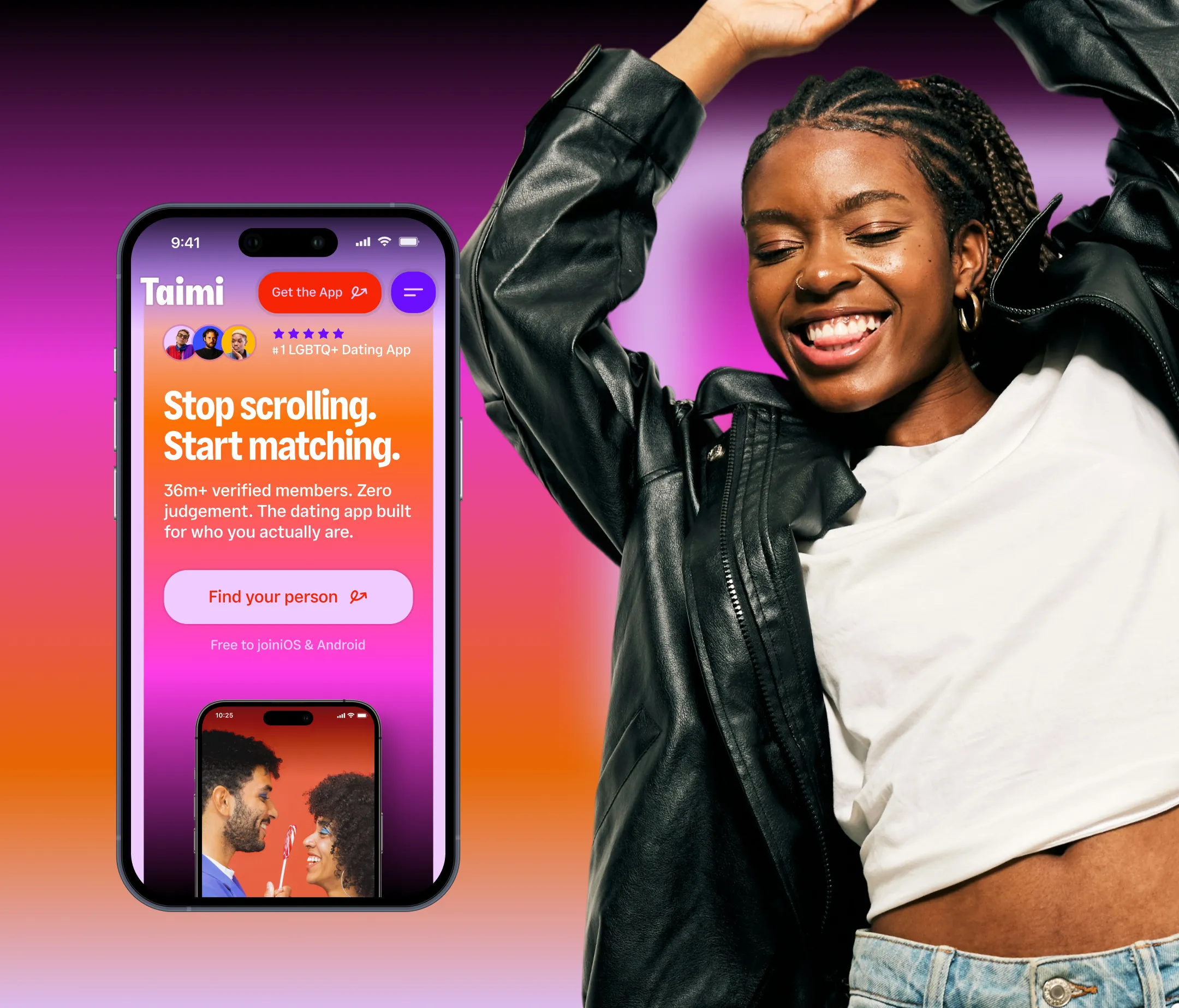
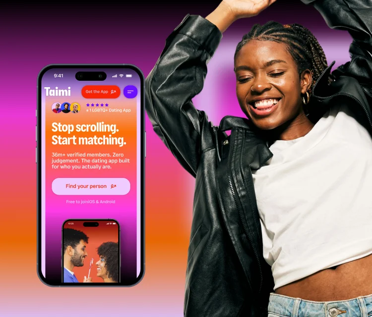
Taimi is a leading LGBTQ+ dating app for queer people looking for dating, relationships, friendship, and community. After a major rebrand, the company needed a website that could reflect its new identity: bold, youthful, expressive, and inclusive.

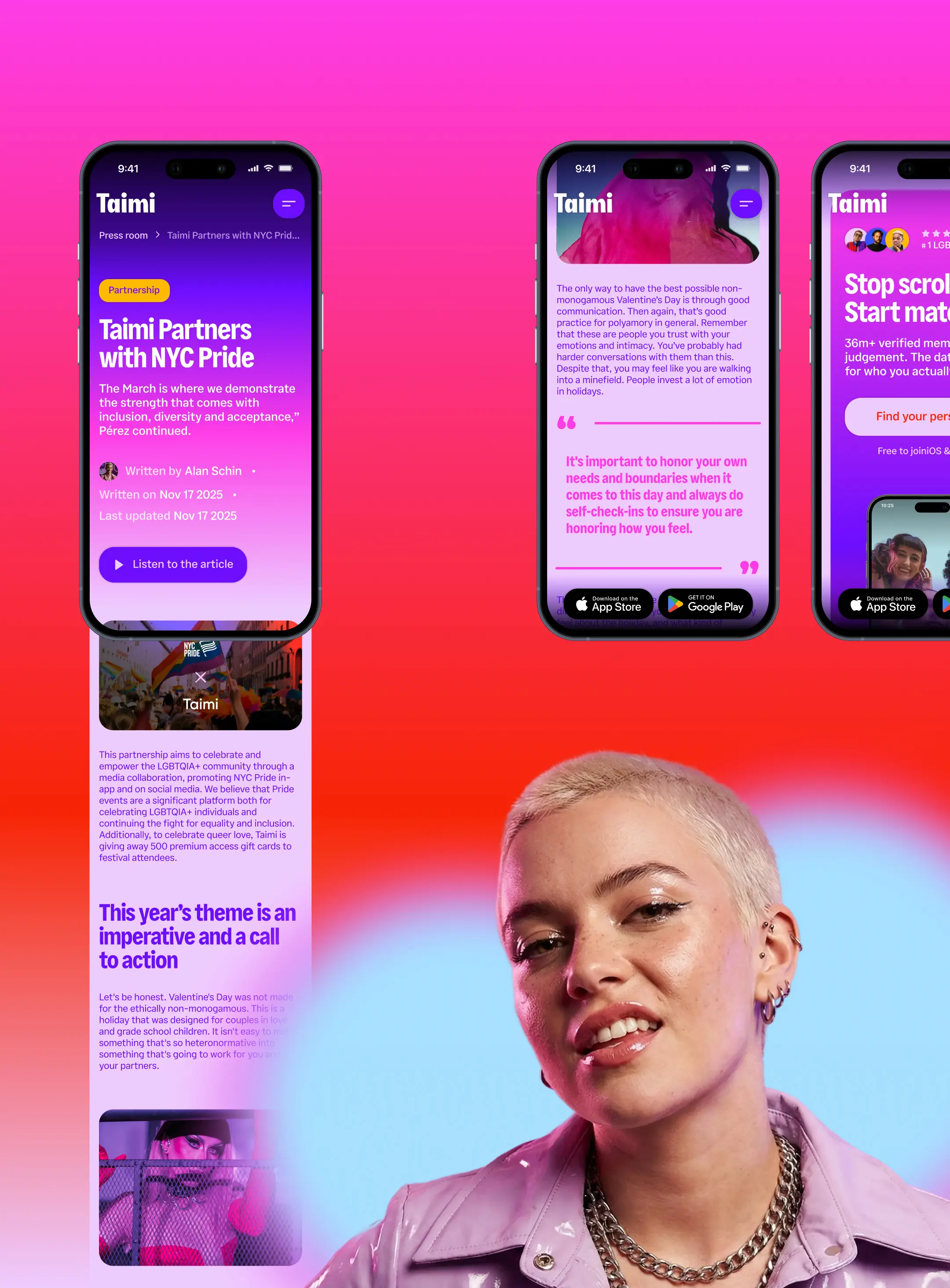
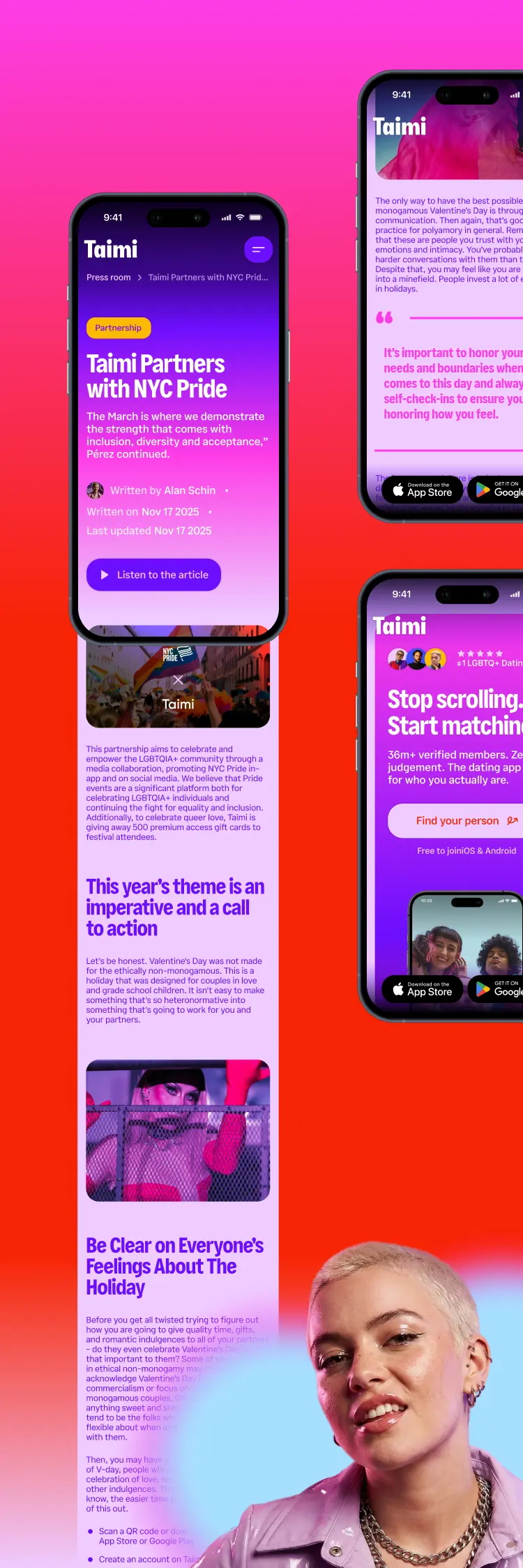
Our team redesigned the website from the ground up, created a scalable design system, and handled development. The project covered around 20 unique pages, plus a wider set of template-based pages for different content needs and audience segments.


The goal was to build a website that felt unmistakably Taimi, supported a large content structure, and made the path to downloading the app clear.

Challenge
Turning a Bold Queer Brand into a Website That Can Scale

After the rebrand, Taimi needed a website that could keep up with its new visual identity and stronger brand personality. The old site no longer matched the way the brand wanted to show up: confident, playful, inclusive, and direct.

The challenge was to bring that energy into a full web experience without making the site feel chaotic or hard to use. Taimi speaks to a wide queer audience, so the design had to feel open and expressive while still giving people a clear way to understand the product.

The website also had to work as a marketing platform. It needed to support many types of pages, stay visually consistent, and guide visitors toward downloading the app without turning the experience into a hard sell.
Outcome
A Website That Matches the Energy of the Brand

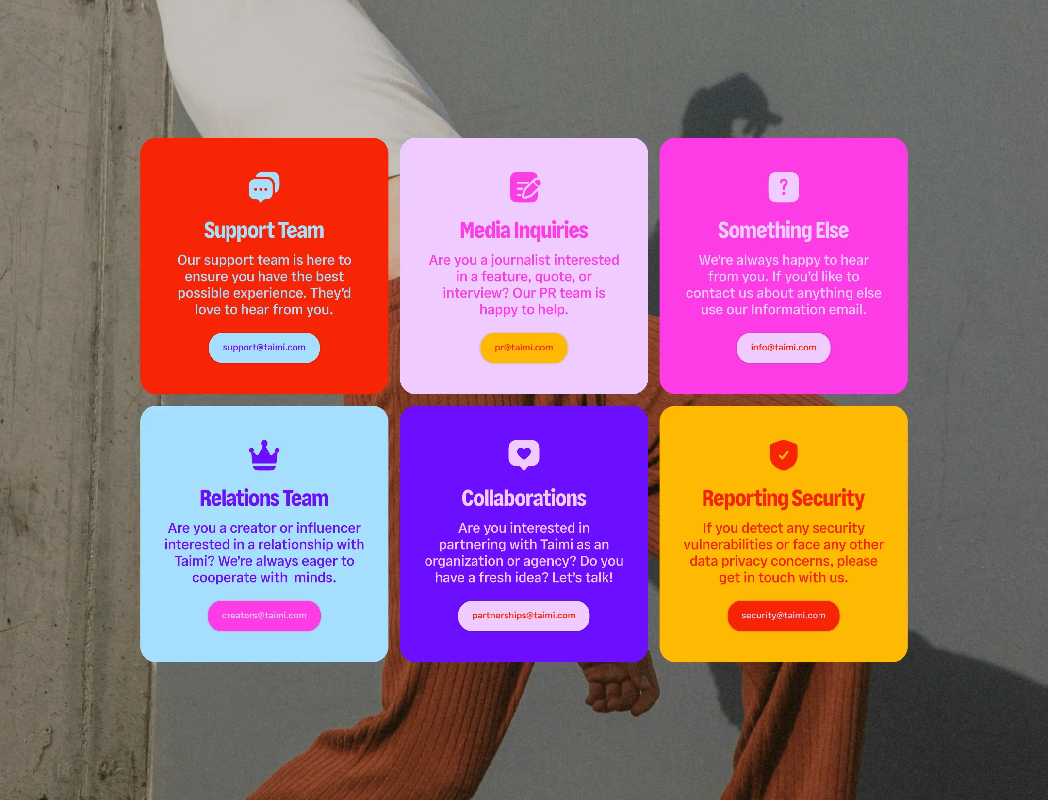
The new website brings Taimi’s brand into a larger, more flexible digital system. Bold typography, bright colors, expressive layouts, real photography, inclusive imagery, and playful interactions give the site a stronger sense of character.

The design system makes the experience easier to scale across core pages, landing pages, and template-based content. It gives the Taimi team a consistent foundation while keeping enough flexibility for different messages and audiences.

For users, the site makes it easier to understand what Taimi is, who it is for, and why it feels different from a typical dating app. For the business, it gives the rebrand a stronger digital home — one that supports acquisition, keeps the brand sharp, and gives future campaigns more room to grow.

After the rebrand, we really needed our website to catch up with the new Taimi identity. The goal wasn’t just to make it look better - we needed a website that could communicate who we are, work for a very diverse LGBTQ+ audience, and still be flexible enough to support all the content and campaigns we have planned.


The new website finally feels like Taimi. It’s bold, playful, expressive, and much closer to how we want the brand to show up! At the same time, the new design system gives us a much stronger foundation for scaling the website and creating new pages and clusters without losing consistency.


For me, the biggest success is that the website now feels like a real extension of the product and the brand, rather than just a place to learn more about the app.

Yana Mukhina

Senior Content Manager